Thursday, February 28, 2008
RI Flower Show Recap

Sunday, February 17, 2008
RI Spring Flower and Garden Show

I started a couple of years ago making tie dyed t-shirts and selling them at craft fairs. It was an important step for me at the time to just get out there and give it a try. I make very nice tie dyes and being able to sell them gave me a real confidence boost. Since then I have begun to develop work that is far more intensive than tie dyes. This is the type of work I love to do and I want to concentrate on. However doing so means I will have to find more upscale venues than high school gymnasiums in order to sell it for what it is worth. Thus the RI Flower Show.
Since it’s a flower show I wanted to have something thematic in addition to my usual work, I had two floral pieces done, the poppies above and the daffodils I made last year. I decided to do a couple more floral piecework banners to compliment those. Here is how it went…
I started with four scetches of designs I wanted to do and quickly realized there was no way I would be able to get them all done in time so I narrowed it down to two.
The little designs were scaled up to the size I wanted and drawn onto transparent film.
I decided I wanted to add a ground element behind the floral to strengthen the composition. I needed more greens for the leaf and ground elements so I dyed a selection of fabrics that I could use together using the soda soak method.
To create a range of 8 greens I started with 4 colors: gold, grey, green and brown each in a 10 grm/1C base solution. By using the same core colors in varying amounts I can create a range of greens that are harmonious.
I started by working out the colors I wanted by using a chart like so:
 Each number represents an equal part (Olive green = 1pt gold + 3pt green + 2pt brown)
To create the 3 different densities I cut the base solution with water to a third of its strength and again to a third of that strength.
The fabric was krinkled up onto a flat surface and the dyes were squirted on using bottles
Dk and Md on one piece Md and Lt on another to create a light and a dark version of each color.
Here is the range of greens I got:
 I used the same process to create a range of pinks and violets.
All fabrics were then cut fused and stitched to create these two new flower pieces


Monday, February 11, 2008
Artistic ADD

Sunday, February 10, 2008
Mokume Ginko Redux


I really like it, now I have to decide how to use it in a larger piece of work!
Wednesday, February 6, 2008
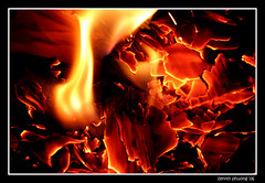
feels like fire

feels like fire
Originally uploaded by Zenith Phuong
This gorgeous photo by is my inspiration for the Project Spectrum Challenge on flickr. For the challenge this year there are 4 color combos each based on one of the four elements fire, earth, water, and air. Each element gets two months so everyone can have a chance to finish. Most of the group are knitters but there are no limits to media just color/concept so I figure there is room for some Shibori. First up is Fire using Red, Orange, Yellow and Pink . I totally love this kind of challenge, open ended, lots of room for interpretation just fun. I will try something a bit more ambitious than I've done in awhile, designing two coordinating fabrics for a particular sewing project...probably a garment. I feel fairly confident about dyeing. However this will require a larger piece of fabric than I've attempted before and that always creates a few challenges. I am less confident about the construction part, I haven't sewed a garment in a while. But I'm getting ahead of myself... I think it will be fun to take part and I encourage everyone out there to join in with their own fire inspired projects!
Monday, February 4, 2008
Itajime dyeing

With this project I was aiming to dye the fabric an indigo blue so very little white was left. Procion dyes are fairly strong and I wanted the design to be as dynamic as possible even though I was only using one color. Using a single color in such a heavy application would most likely come out looking something like this:
 large blocks of color with very little fluctuation of tone, not very interesting…
So I opted to use the Navy color in three strengths.
I started with 3c of a dark navy solution ( 20gm>1c),then I took 1c of that and added 1c of water to create a half tone(10gm>1c),
then 1c of the half tone and added 1c water to create a quarter tone (5gm>1c);
Once I had the three tones of dye I dipped areas of the folded fabric into them
2 corners into the lightest
1 corner into the mid
then I went back over the areas I had dyed with the light tones and applied the darkest color with a sponge brush on top or overlapping (here all three edges of the triangle)

The difference in the fabric's wetness and the way the lighter colors dilute the darker dye helps to create a more dynamic pattern
